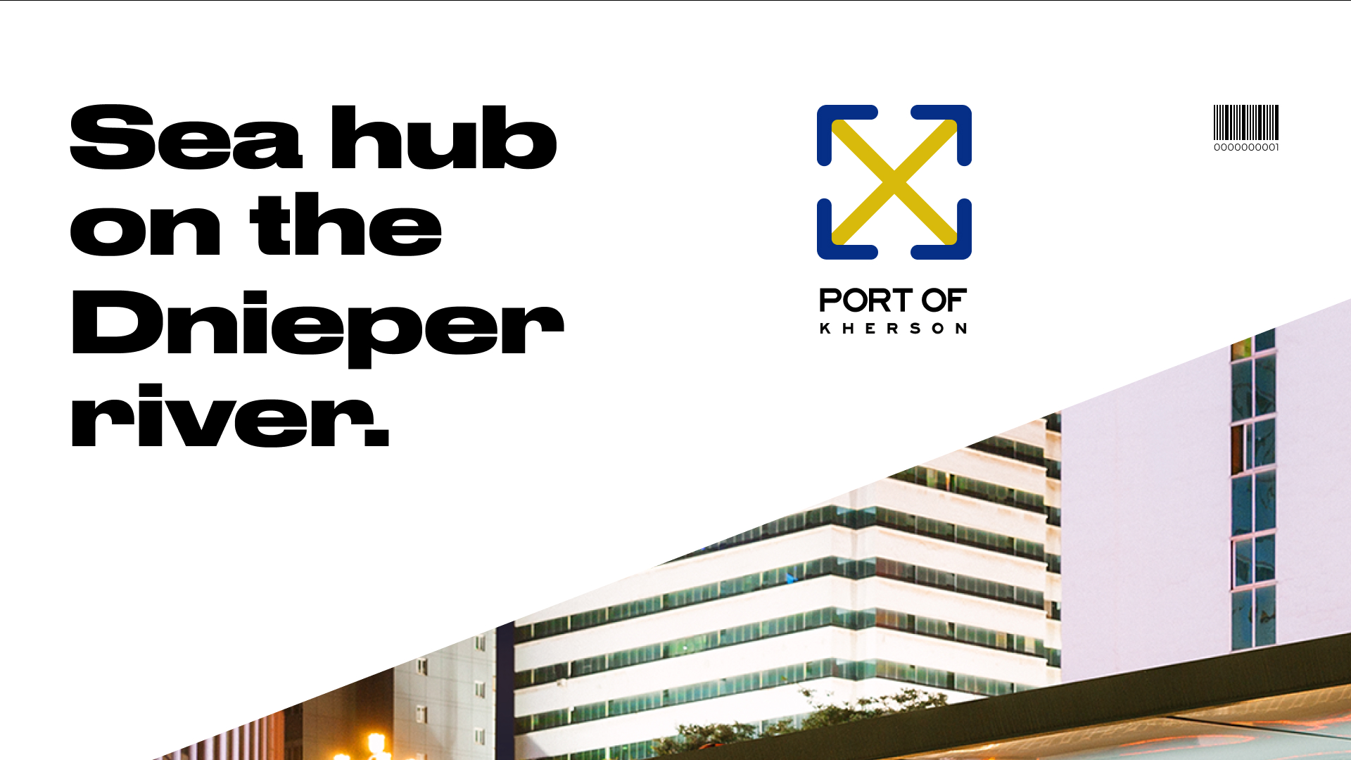
Corporate identity «Port of Kherson» Ukrainian transport complex


Rebranding of an enterprise that is part of the unified transport complex of Ukraine! Kherson Commercial Sea Port has received a new look. The symbol of containers, holds or boxes, laid out in a square shape. Logistics and delivery of goods in the arrows, in the corners of the logo. The color refers to the flag of Ukraine, hinting at nationality.
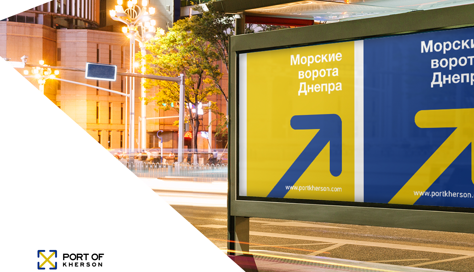
The redesign of branded waste paper, using the arrow as a branded graphic, makes the company’s identity recognizable and makes it look more modern.


Let's talk
about the
project

Use our expertise to build a secure, scalable product and get to market earlier

Fill out the form below:

UI/UXРазработкаВеб ДизайнИнтернет магазинБрендинг3D ДизайнДругое
Your message has been sent
hello@terentevdesignstudio.com
GREAT
EXPERIENCE
TO GET THE
AWESOME
PRODUCT
Next * Cases
Создание 3D-визуализации системы внесения жидких удобрений для рядных сеялок.
SRD
3D visualization of the liquid fertilizer application system for row crop seeders.
Bazar
Branding for Kherson agricultural center «Bazar»

The unique image of the Kherson port: a reflection of the energy and beauty of Ukraine

Kherson port is one of the main maritime transport hubs of Ukraine, located on the banks of the Dnieper River in the city of Kherson. Its strategic location creates a connection between Ukraine, the Black Sea and other international routes.

Create a unique style for the port

We were invited to develop a unique image and style for the port of Kherson. The main goal was to create a visual representation that reflects the features of the port and its connection with Ukraine.

We were provided with a detailed description of the port of Kherson and indicated color preferences based on the bright yellow and deep blue colors of the Ukrainian flag. It was important to create an image that would reflect the dynamic nature of the port and be in line with Ukrainian national symbols.

Design development of Kherson port

Our team started working on the development of the image, taking into account the main characteristics of the port and the requirements of the project. We have carried out a thorough analysis to create a unique and memorable image.
To convey the dynamics of the port, we decided to use the image of the ship in motion. We’ve also incorporated bright yellow and deep blue into the look, matching the national colors of the Ukrainian flag, to emphasize the connection with the country.

After developing the image, we moved on to creating a unique style for the port of Kherson. We developed a set of graphic elements, fonts and colors that blended harmoniously with the image and created a coherent impression.

Bright yellow symbolizes the sun, energy and optimism. It is also associated with wealth and prosperity. The deep blue color reflects the sea and sky, emphasizing the connection of the port with water spaces and international routes.

To create the impression of movement, we used smooth lines and transitions in the image. The font chosen for the style was clear and modern, reflecting the professionalism and modernity of the port of Kherson.

Seaport website branding

The result of our work is a unique image and style that effectively conveys the character and features of the Kherson port. The brand of the Kherson port now has a memorable image, corresponding to its importance and role in the maritime logistics of Ukraine.

We have successfully completed the development of a unique image and style for the port of Kherson. Our work allowed us to create a visual concept that reflects the dynamic nature of the port and its connection with Ukraine. The brand of the Kherson port has received a new image, which will contribute to its successful promotion in the field of maritime services.

View
Open